
At a recent trade fair, I witnessed a presentation by a physician. He had copied and pasted many tables straight from a scientific publication and merely annotated them here and there. The effect was twofold: firstly, he didn’t generate the impression of having invested much time and effort into setting up his slides – communicating to the audience that he did not deem them important. He reinforced that impression by reading the tables, turning his back to the audience.
And secondly, it was extremely hard to read the text. Not only was the layout optimized for print, but the sheer size of the tables was so big that, in order to fit them onto a single slide, it didn’t allow for more than tiny letters. In fact, his annotations with PowerPoint routinely were larger than the annotated text!
Yet still, I have even seen Medical Writers claim that scientific presentations fundamentally follow the same guidelines as publications. Well, certainly they both try to communicate scientific content, but do they really follow the fundamentally same principles?
DYNAMIC VS. STATIC
When reading a publication, without external disturbances, appointments etc., we are masters of our own time. We can decide how much time we spend on an individual section; we can read and re-read it at leisure; we can follow references or research individual points that may not have been readily accessible for us to ensure that we have understood the content.
Of course, in the real world, we do not have an infinite amount of time, and often less time than we’d like to read the literature of our field. But we still have a lot of flexibility, to the point of putting down a “paper” and picking it up again the next day where we left off. The information doesn’t go away; it is always there, and we are free to go back a page, jump forward a page and review something we already read earlier.
In a presentation, on the other hand, the speaker controls the time for which certain information is accessible to us. If we, as members of the audience, are not done with a certain figure, that’s our loss. At best, we can ask during Q&A to redisplay a certain slide.
But what if we were left behind by half the presentation? Moreover, in a publication, if the discussion of “figure 4” references something said about “figure 2”, we can simply turn back a page or look up and check figure 2. In a presentation, if you say “As we’ve seen a few minutes ago…”, how can you be sure the audience remembers the details of what you showed?
Making the dynamic work for you
That dynamic nature brings advantages of its own: we can use transparent or non-transparent overlays, making the differences between two pictures more obvious by not presenting them side by side but showing the changes dynamically, switching back and forth between the individual states.

Dynamically adding and removing information to manage information load
We can only show part of the whole and introduce the rest step by step – even with non-editable pictures, you can use the crop function of PowerPoint, for example, to only show parts of a figure.
We can even use video or create pseudo-videos by moving through different views of the same object in successive slides – possibly even using the morph transition to make the whole procedure even more dynamic and fluid. Whether it’s different sections of an organ or a machine, we can create the impression of moving through it by presenting different sections one after the other in otherwise identical slides.
A presentation can illustrate changes in time or space much more visually than a static publication ever can.
SOURCES OF INFORMATION: TWO VS ONE
In a publication, we have a single source of information – the publication itself. While we may alternate between text, tables and figures, we can focus on each when appropriate.
In a presentation, however, we have two sources of information – the projection and the speaker, both competing for our attention. When we try to discern the content of the projection, we can’t grant our full attention to the speaker. And when we follow what the speaker is saying, our focus on the projection is limited.
Yet a lot of slides in scientific presentations contain so much information that they will bind our attention for a considerable amount of time. Often, the speaker will announce “This may seem intimidating at first but let me walk you through this slide” – or something to that effect – which half the audience will be oblivious to, as they are already trying to make sense of the data presented.
As discussed above, you can prevent that by using the dynamic nature of presentations and introducing information bit by bit, as you talk about it.
Likewise, speakers will often try to avoid this competition by simply reciting the content of the slide – as the speaker in my example did. But if the speaker does that, what’s the added value of his or her presence? The audience might be better served with a printout.
You don’t demonstrate scientific expertise by reading a text – you demonstrate it by explaining study setup, outcome and meaning!
VISUAL ANCHORS
There is the widespread misconception that the arguments and points raised by the speaker need to be spelled out on the slide to provide a ‘visual anchor’ for the content for those people who process visual information better than oral, and as additional reinforcement.
Leaving aside the debate on the scientific validity of learning types, in the absence of eidetic memory,
A wall of text is remembered as just that – a wall of text
It is not suitable to anchor specific content because it could just as much be some “Lorem ipsum” as a table from the latest issue of Nature.
A visual anchor needs to be iconic, from a striking visualization (think “science image of the year”) to a metaphorical, symbolic picture – a crossroads or a fork in the path for an important decision, a cemetery for the death toll of a disease etc. If the visual anchor is not in and of itself memorable, it cannot anchor anything else either.
LAYOUT
Even PDFs are laid out to be read hands-on – either printed on paper or at a minimum in direct interaction with the reader at the computer, who is free to turn the page or magnify parts of it.
Pages are, with rare exceptions, set out in portrait style. Presentations, of course, are in landscape style. This leads to the figures and tables being transferred from one to the other often being either turned 90°, possibly also turning text into the vertical, making it less accessible to the audience, or squeezing the whole figure, making the whole depiction much, much smaller and harder to discern.
Add description
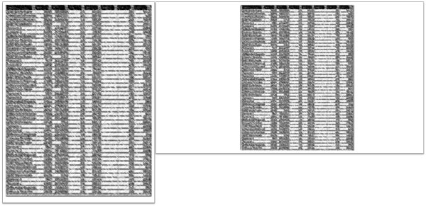
Printed portrait page simply copied and pasted onto a landscape presentation slide.
FONTS
A lot of traditional publications also use serif fonts. While the jury is still out on the advantages and disadvantages, the serifs are easily lost in a bright projection and fail to have any effect on the rear rows either way.
Most presentations use sans-serif fonts, so copy/pasting text from a PDF will give a disjointed look to your presentation that can easily look unprofessional if setting apart this specific content isn’t a major point.
What copy/pasting text from a PDF also does is lock the text at a certain resolution – magnifying it later on can turn easily readable text into a blurry mess. A direct transfer limits the options of your slide layout and is only advisable when there is no other way to transfer content (e.g. photographs).
If it’s too much text to type it again, it’s likely to also be too much text for a single slide
THE KEY TO GOOD PRESENTATION SLIDES
Cutting corners will invariably cut into the efficiency of your presentations.
Simply copy/pasting a few slides together from premade material in a few minutes signals your audience that they are not worth your time and effort. If you can’t be bothered, why should they?
Realize that you’re dealing with a medium that is different to printed publications. What we need to accomplish with our slides is thus not, as it is with a publication, to make the whole argument for us. What the slides need to do is provide the data necessary to support and reinforce the key points. Present the data that needs to be shown when you’re talking about it and reinforce your key arguments with powerful visuals.
Print and presentation each have their own strengths – it is by recognizing them, and planning our content to leverage them, that we communicate effectively.
Originally published at https://www.presentation-guru.com/reasons-why-you-shouldnt-just-cut-and-paste/
Photo credit: wuestenigel on Visual hunt CC BY